VCLEVER BLOG
Tired of the dated, fussy design of the Hootsuite dashboard? I was, so I created a new cleaner version, which you can use on your own Hootsuite dashboard (if you use Chrome or Firefox).

Restyling Hootsuite
Here at vclever, we’re big users of Hootsuite, a social media dashboard that makes it easy to manage multiple accounts on Facebook and Twitter, amongst others. But the hideous appearance of the dashboard niggles at me. While others, like Twitter and Google+, have been rolling out beautiful new looks, Hootsuite’s three themes are starting to look a bit tired and dated thanks to thick shadows and strong gradients plastered everywhere, and colour-schemes that are less than tasteful.
Although I had better things to be doing at the time(!!), I decided to dabble with Hootsuite’s CSS using Chrome’s developer tools to make the appearance fresher, easier on the eye, cleaner and brighter.
[QUICK EXPLANATION OF THAT LAST SENTENCE FOR NON-TECHIES: CSS stands for Cascading Style Sheets, which basically control the appearance of websites (spacing, layout, text-size, colour-schemes etc etc). Chrome – Google’s brilliant browser – has a set of tools for developers that lets you view the CSS code that applies to any part of any web page. You can then edit that code to see what your changes do to the appearance of that page. You’re just temporarily changing how things look to you on your browser and any changes you make will be gone when you hit ‘refresh’.]
So, I made changes to Hootsuite’s appearance for my own amusement and was just going to post screenshots of the results (to say, ‘hey Hootsuite, here’s what I think your dashboard should look like’), when I found this post which mentioned a Chrome/Firefox plugin that allows you to permanently apply CSS changes to any site you like. Marvellous! I could now actually use my new theme as opposed to just admiring a screenshot!
Before and after
Before we get to how to apply my theme (or anyone else’s) to your own Hootsuite Dashboard, let’s have a look at the changes I’ve made (click on the images to see them full-size):
BEFORE – the Hootsuite Dashboard with ‘Classic’ theme
")
AFTER – the Dashboard with my redesign applied
")
What’s changed?
The thing that bothers me most about the current dashboard is the dreary grey gradient applied to the background of every post. I’ve now made these solid white and with a simple blue divider. I’ve tried to improve readability by increasing the padding, as well as making both the image thumbnails and post titles larger. The theme uses bright, light blues, whites and subtle greys to give a lighter, bolder and more coherent look than any of the current Hootsuite themes (in my humble opinion, of course!).
What started out as a few quick fixes here and there then got a bit out of hand, as I set about modifying most elements including buttons, navigation bar, menu items, dialogue boxes and headers. The basic idea was to simplify and beautify – removing harsh gradients, text shadows, box shadows, ugly or unnecessary borders, and introducing a cleaner look with more white space, coherence and clarity. There will of course be areas that I’ve missed in this quick sweep (and these modifications work best with the ‘Classic’ or ‘Blue Steel’ themes, as opposed to the ‘Magnum’ theme), but I’ll update my modifications as and when I find any niggles or bits I’ve missed.
How to get this theme on your own Hootsuite dashboard
I shipped all my CSS changes into userstyles.org to create a restyled Hootsuite theme that I’m now using on my Hootsuite dashboard. And anyone can apply it very easily to their own Hootsuite dashboards too by using a Chrome/Firefox extension called ‘Stylish’…
A few easy steps to install the new theme:
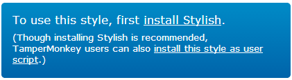
- Go to my Hootsuite theme page on userstyles.org
- Click on ‘Install Stylish’ (or if you use Firefox, click ‘install just Stylish’)
- An ‘Add to Chrome’ box will pop up – click ‘Add’ (in Firefox, click ‘Allow’ and then ‘Install now’ and then ‘restart Firefox’)
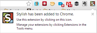
- A message will pop out from the newly added ‘Stylish’ button to show it’s installed (in Firefox, you’ll get a ‘Congratulations’ screen and you’ll need to go back to the theme page to continue)
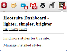
- Now click the big green ‘Install with Stylish’ button and click ‘OK’ when it asks for confirmation (or ‘install’ in Firefox)
- It’ll then say ‘Style installed!’ on the page
- YOU’RE DONE! Just go to Hootsuite and your dashboard should now look beautiful (in Chrome, there’ll be a little red ‘1’ on the ‘Stylish’ icon in the toolbar to show it’s active, whereas Firefox will have a little icon in the bottom-left corner)
- If you want to revert to the original theme at any time, just click on the ‘Stylish’ button and choose ‘disable’. You can reactivate it by clicking ‘enable’.


![]()
Well, that’s it – hope you find this useful. Please let me know in the comments if you’re using the theme or have any suggestions.
Filed under: All, Articles, Design, Technical stuff | No comments yet